workspace transformation
Perfetti Van Melle
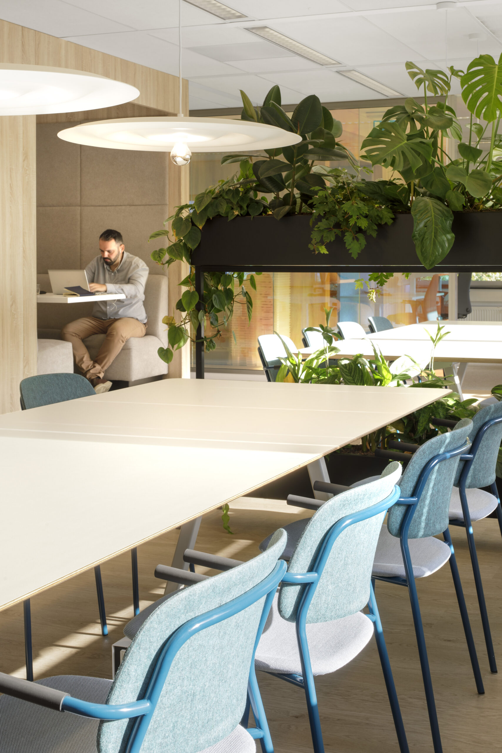
A new interior concept and interior design in Schiphol Oost has people flock to this candy inspired regional hub. The workspace is a combination of offices, public meeting area and client rooms.
Perfetti Van Melle is one of the world’s largest manufacturers and distributors of confectionery and chewing gum. The company produces and markets a host of top-selling candy brands, including Mentos, Fruittella, Brooklyn, Alpenlieve, Golia, and Frisk with factories and manufacturing sites across the world.
In Schiphol Oost, the original office was located on the ground floor and the entire 1st floor. The client was expanding and going to rent the entire 2nd floor (849 m2) from 1 January 2022, above their existing office on the 1st floor (837 m2 LFA). They needed a workplace experience that suited their new way of working in a changing world. The additional floor was to be designed in alignment with the existing office.
Perfetti Van Melle
client
2022
year
Schiphol Oost
location
1500
m2
Function
EMEA office, public meeting area, client rooms, workplace community.
bs;bp design team
Rabia Zuberi, Frank Twilt, Jolanda Luymes, Begoña Masiá, Melle Stumphius
Project partner
PHOTOGRAPHY: EWOUT HUIBERS
The challenge
Working with the existing outdated space we had to transform this through a modern design. Making the workspace better suited for the growth ambition of this legendary international candy brand.
The client also wanted a space that employees would be excited to return to after the pandemic lockdowns and their transition into hybrid working. In fact, even before the pandemic, employees would seldom interact and would often have lunch on their desks. Storage space was also a big challenge with sample boxes piling up all over the rooms.
The solutions
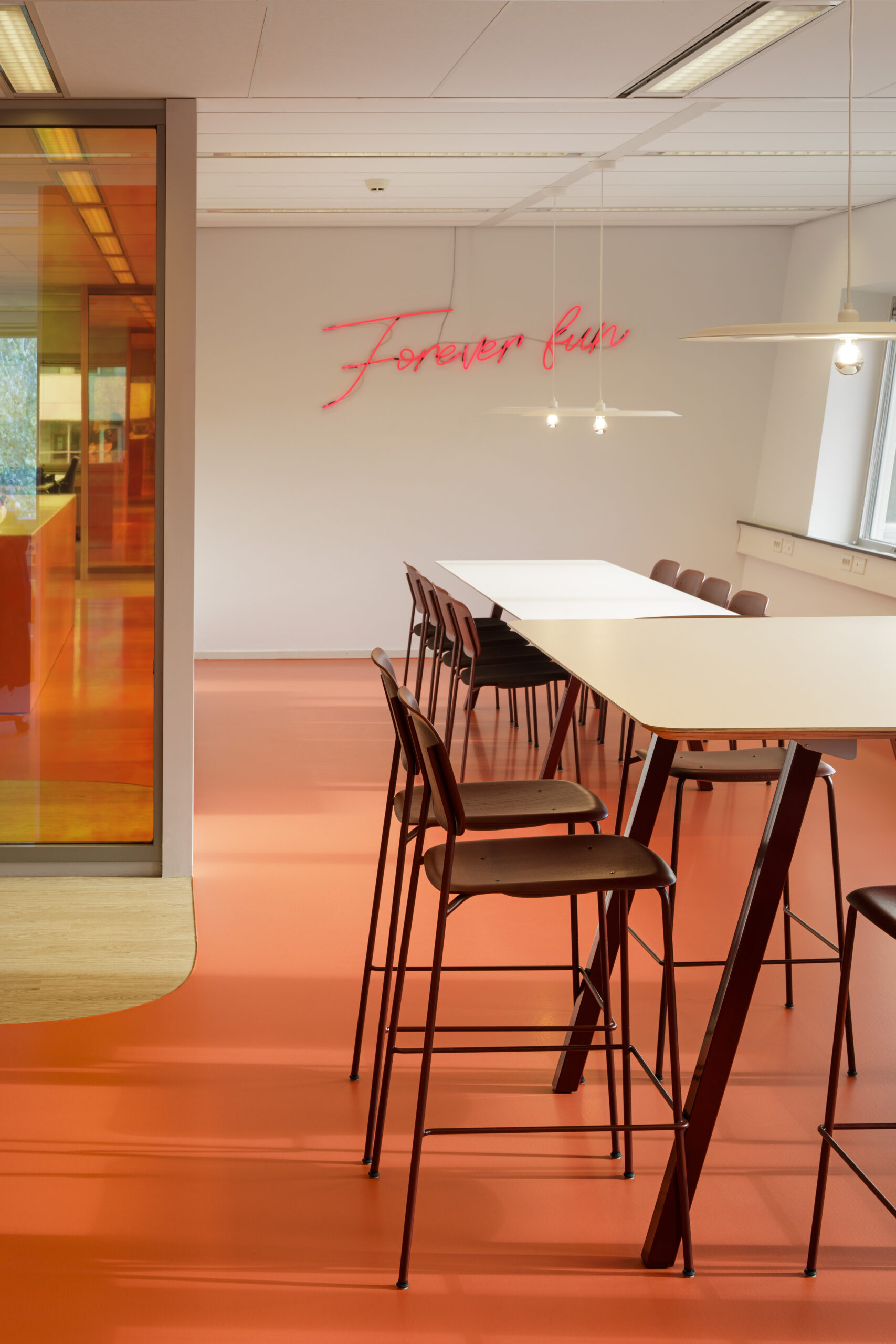
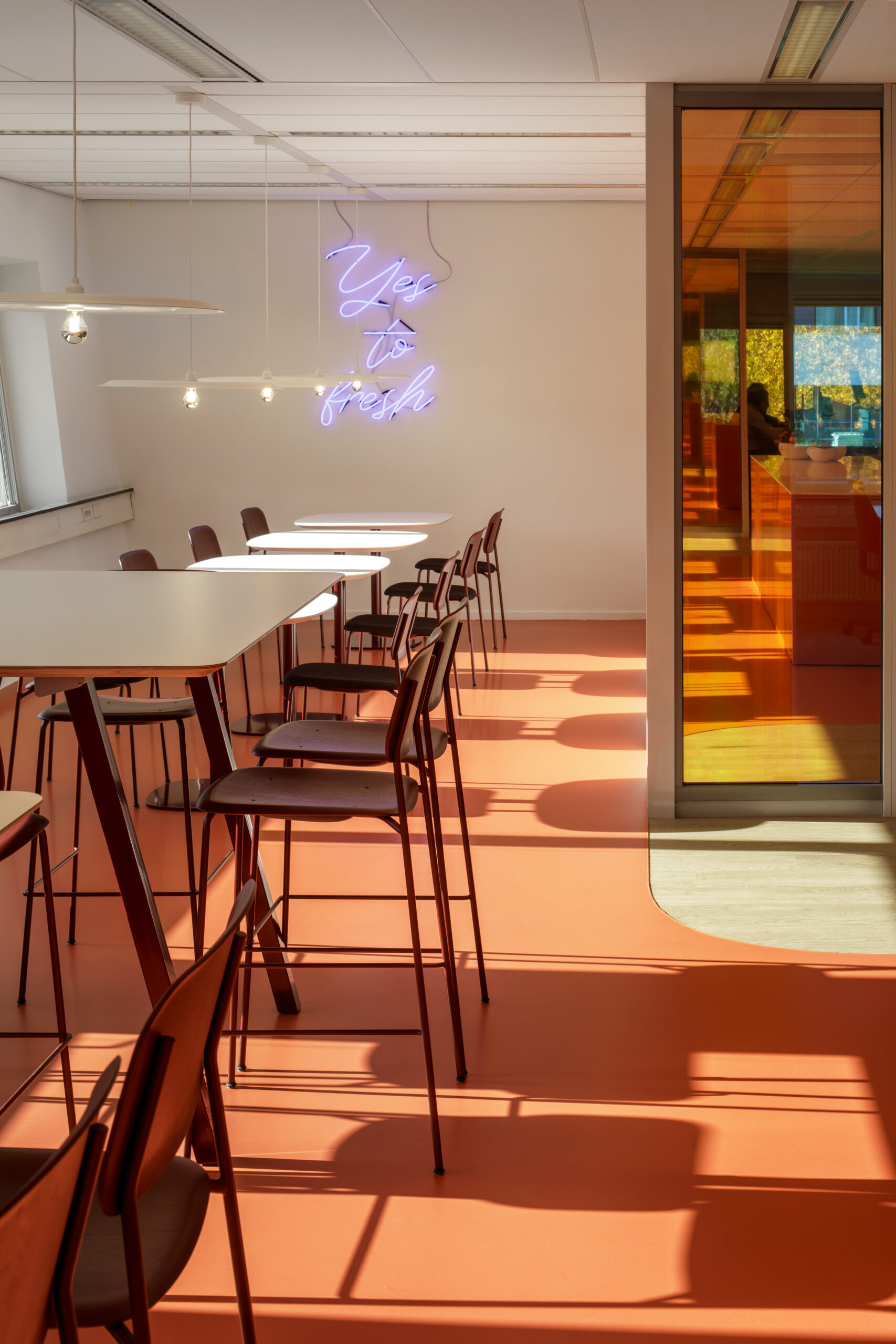
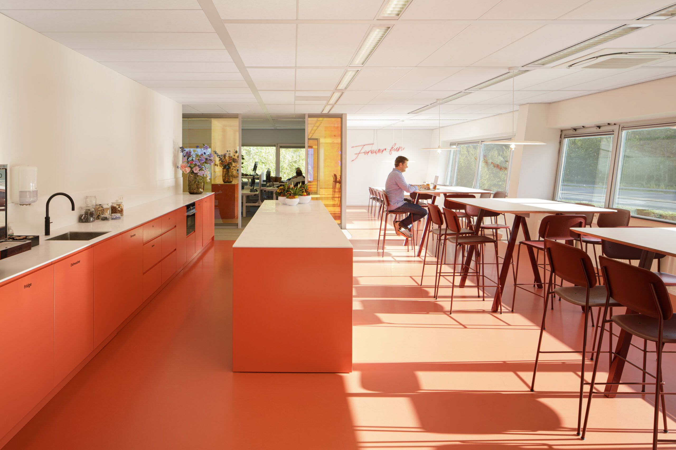
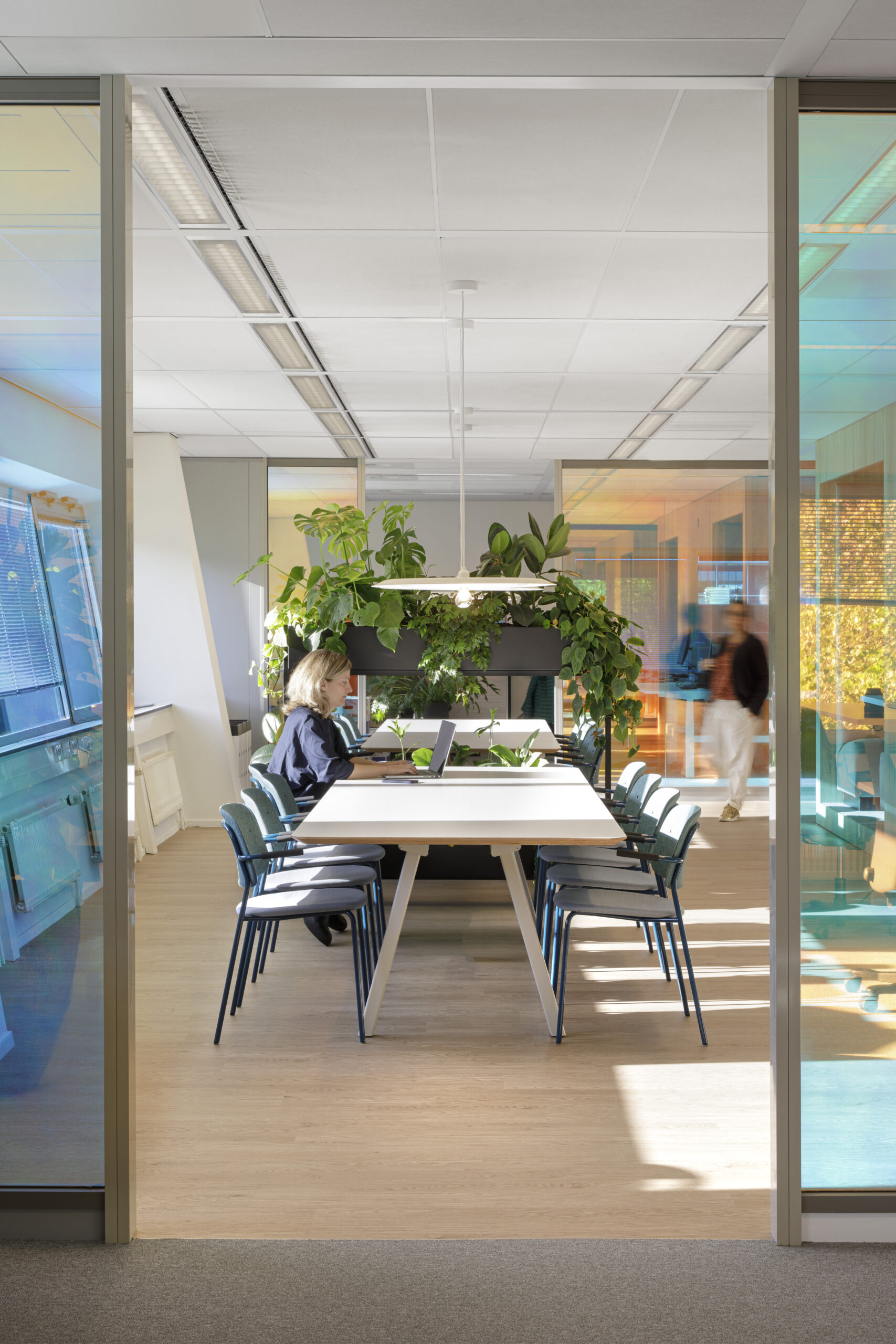
We implemented various solutions for pinpointed challenges: We created a division for the public-facing floor with meeting rooms, team rooms and reception on the first floor. And quiet working areas as well a central well-lit café area on the second floor.
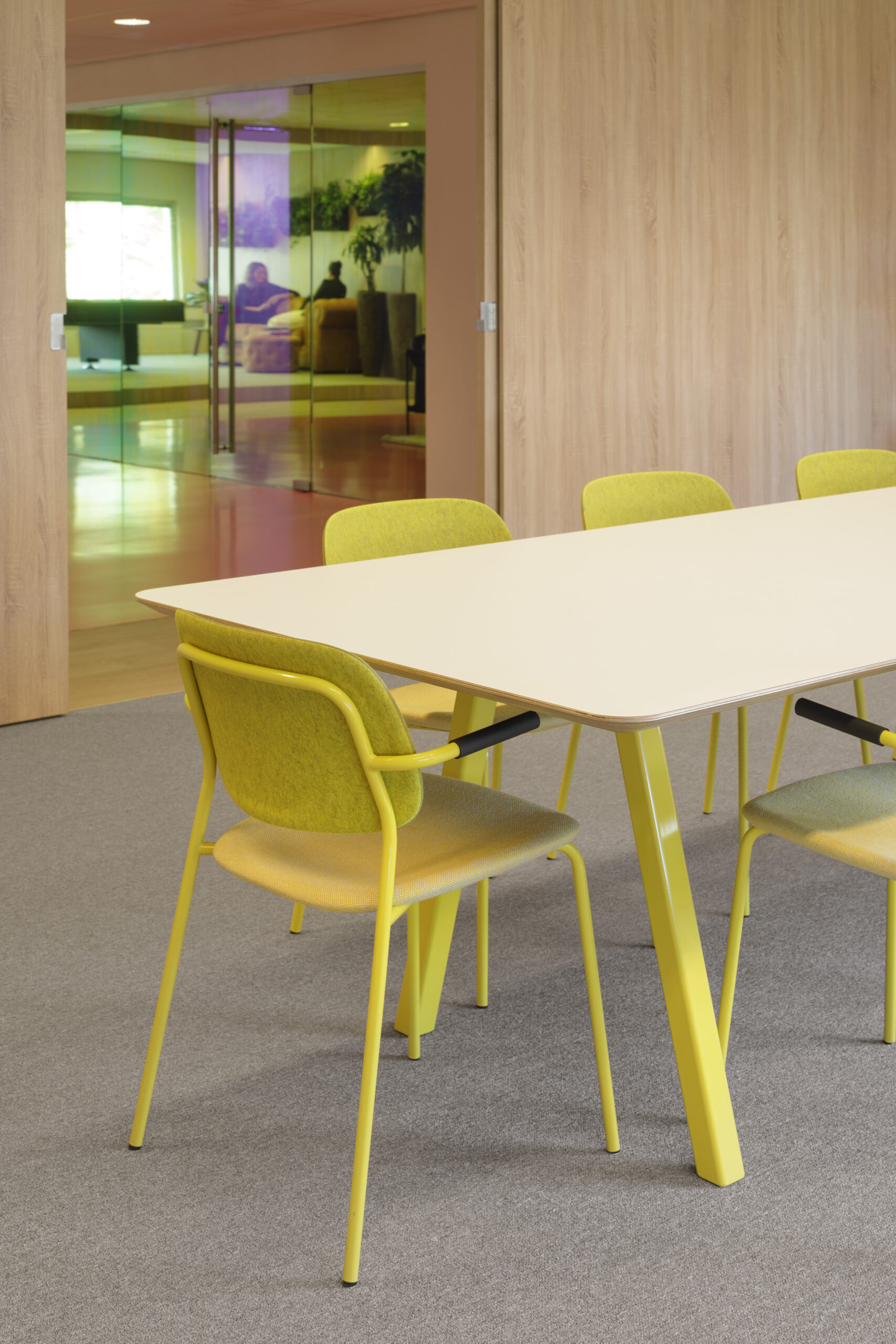
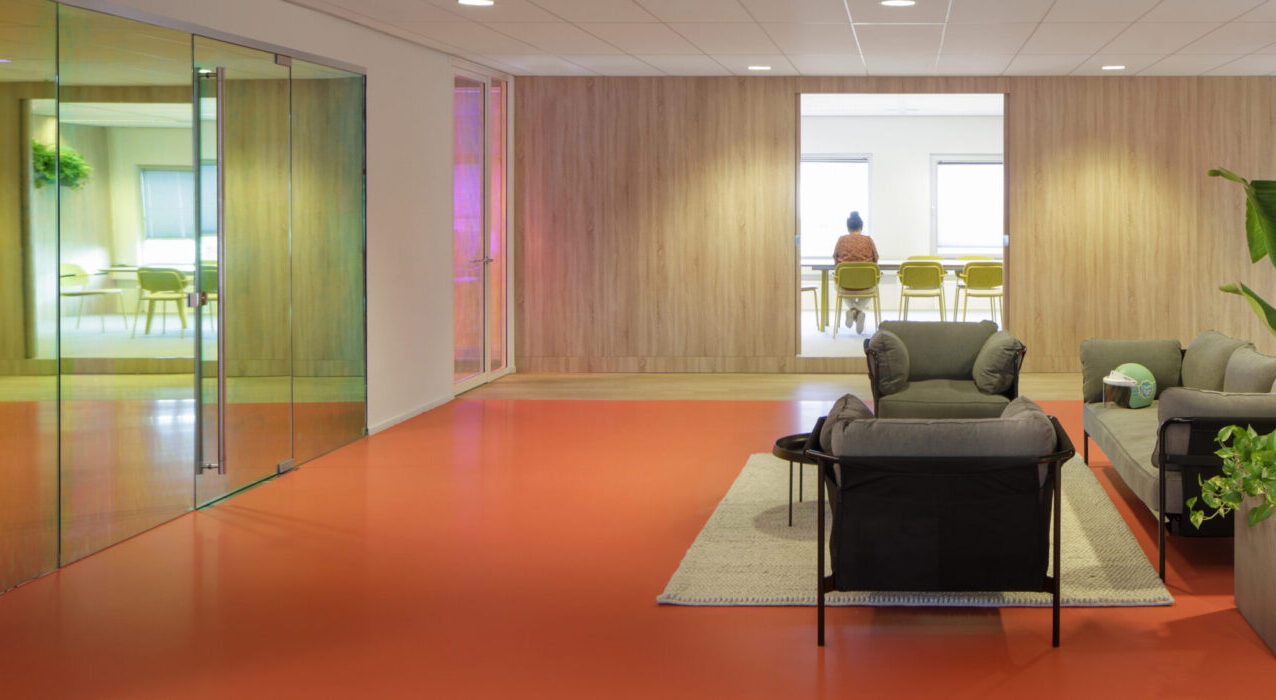
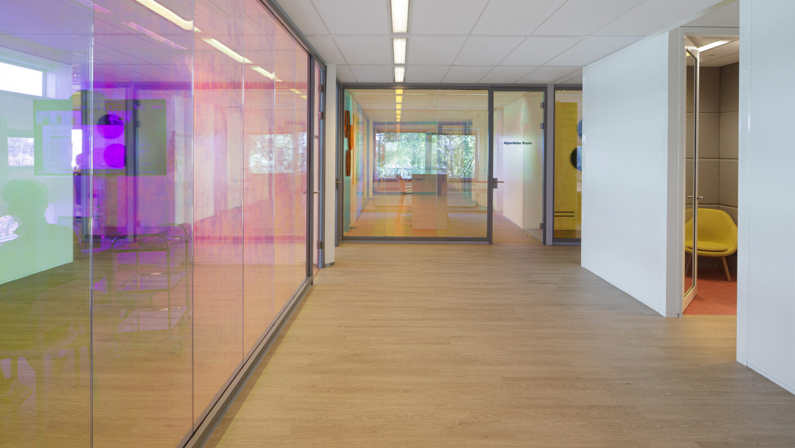
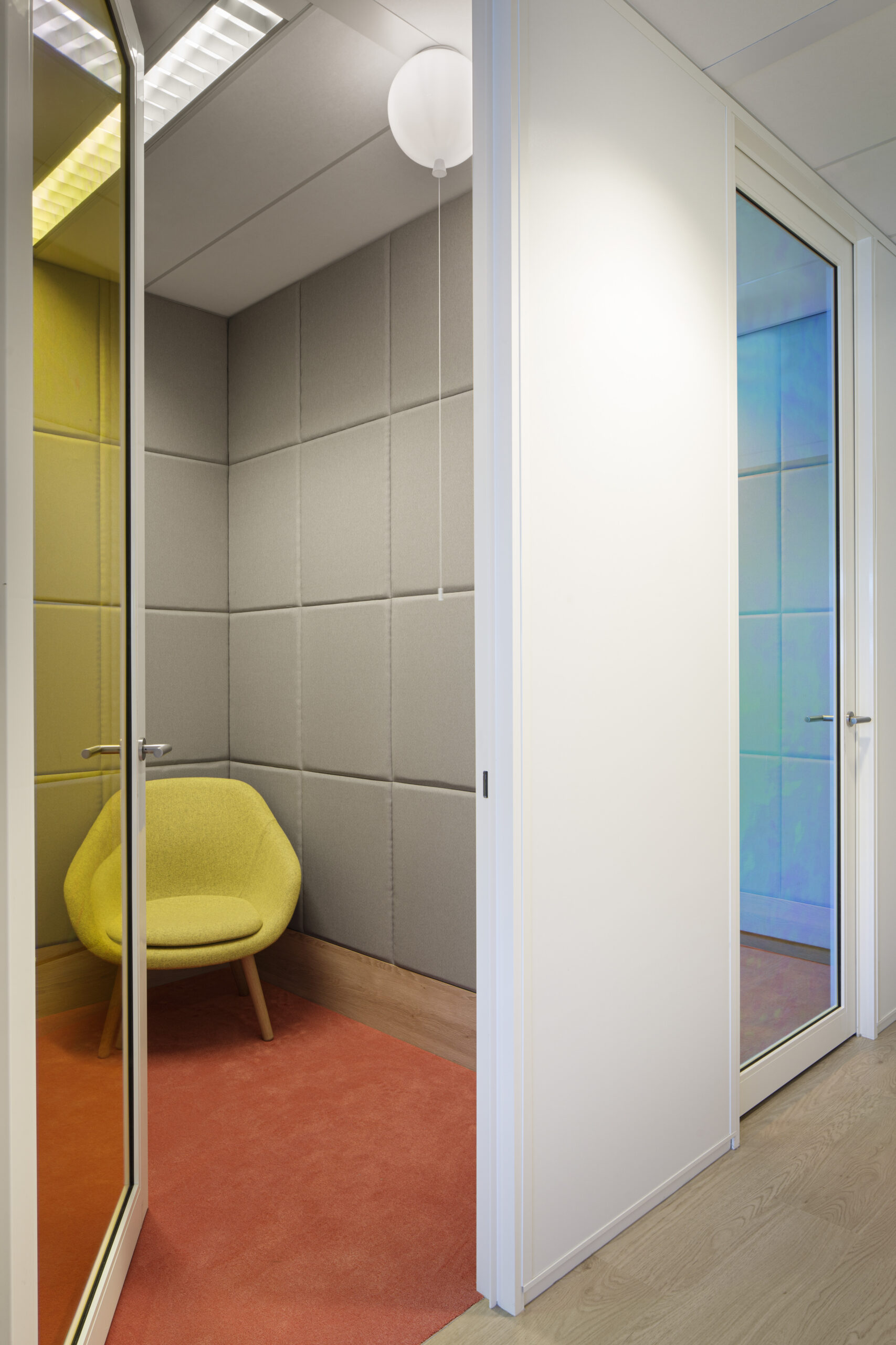
To create a physical and visceral connection between the two floors we proposed to create a void from the reception with a connecting staircase as there was no direct connection between the two floors. The use of Di-chroic film was a first for us. We strategically placed it in some areas but after the first test on site the client loved it so much that they applied it to all the interiors glass partitions!
“The best parts are the common areas, amazing! The kitchen on the 2nd floor, the library area and the train seats. Overall, we really enjoyed bs;bp’s creativity and your fast way of working.”
– Hind Keijzer, Perfetti Van Melle
Do you face a design challenge?
Speak to one of our experienced designers, without any obligations.
Discover how better space and better people do better together.
